7 minutes read
Interparking app
A redesign of the Interparking app to bring clarity, speed, and modern UX to everyday urban mobility

CASE STUDY
Role
Product design
Scope
UX/UI, flows
Platform
iOS & Android app
Status
In documentation
BEFORE THE REDESIGN
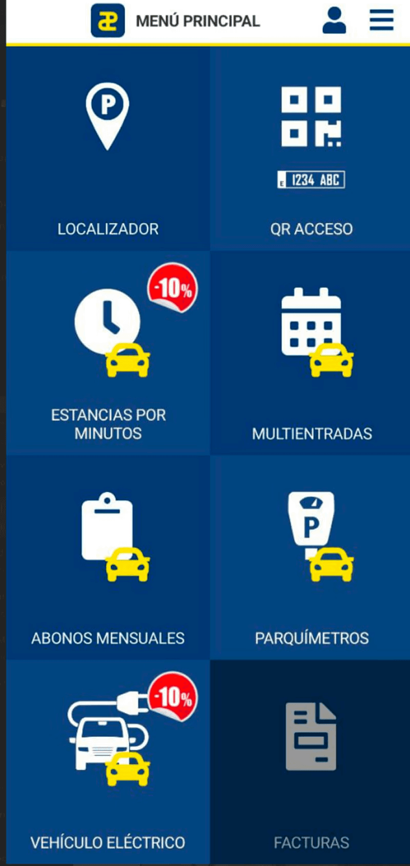

AFTER THE REDESIGN


Context & user needs
Interviews with a usual client showed the need to acccess core features and informarion quicker than what the app delivered
Core app journeys
Redesigned the app to provide instant access, ensure a frictionless checkout, and replace wasted screen space with useful information
Interface decisions
Used the wasted space of the icons to include usefull at-a-glance information, and kept the QR Access button always on the screen
Personas
Designing for urban mobility means serving two distinct mindsets: the rushed commuter who needs instant, one-tap QR barrier access and effortless payments from the home screen, and the city visitor who relies on glanceable tracking of their exact floor, spot number, or EV charging status
Real world context
Navigating real-world parking facilities means dealing with underground signal dead zones and time constraints. The redesign directly addresses these environmental roadblocks by prioritizing instant QR access that scans at the barrier. Whether renewing a monthly subscription on the go or checking remaining multi-ticket passes before approaching the garage, every transactional feature is streamlined for fast, one-handed operation under high-stress conditions
Constraints
To ensure the app remains highly functional in harsh physical environments, I developed a cohesive visual language based in components and strict accessibility standards, prioritizing high-contrast palettes and large, ergonomic touch targets for effortless one-handed use. By establishing a clear visual hierarchy, critical actions naturally dominate the screen, while modular components and comprehensive UI states guarantee a consistent, predictable experience across every step of the journey
Pain points
The original Interparking experience suffered from critical usability bottlenecks that directly contradicted the haste required in urban mobility. Primary features like the barrier entry QR code buried under many options. At the same time, the home screen wasted valuable real estate on huge buttons rather than offering glanceable updates on active parking duration, accumulated costs, or exact spot locations. Coupled with unclear multi-ticket management, the baseline app demanded excessive cognitive effort right when users needed simplicity and instant results
